
I used to smoke. Quite a lot, as it happens. I finally stopped when I was about 31 or 32 and, while I can't pretend quitting was particularly enjoyable, I can safely say I don't miss cigarettes now. But I do miss cigarette advertising. There. I've said it.
In 2011, when the Government published a new Tobacco Control Plan for England, I found myself on BBC Newsnight talking about the evolution of tobacco advertising. At the time, I was Creative Director at Red C and had written an article for the agency blog arguing that some of the great cigarette campaigns deserved to be remembered not simply as advertising, but almost as a form of street art.
That probably sounds slightly perverse today. Until you look at the work.
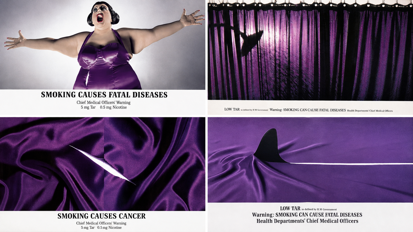
A sheet of purple silk with a razor-sharp cut running through it. A Benson & Hedges packet appearing in some enormous, inexplicable surreal landscape. An iguana staring suspiciously at proceedings. A huge purple curtain stretched across a canyon. A fat opera singer whose satin dress has split open at precisely the right moment.
Sometimes there was barely a headline. Sometimes there wasn't even a recognisable product. Instead, you got a visual puzzle sitting on the side of a building or beside a road, inviting you to spend a few seconds working it out.
And the extraordinary thing is that much of this creativity emerged not despite the increasing restrictions placed on tobacco advertising, but because of them.
Which makes cigarette advertising one of the most fascinating examples I can think of of what Adam Morgan and Mark Barden would later call a beautiful constraint.
The brief that kept getting harder
First, the awkward and necessary bit: the restrictions were there for very good reasons.
Smoking kills people. Tobacco advertising helped normalise and promote smoking. Preventing tobacco companies from advertising their products was an entirely defensible piece of public-health policy.
But the restrictions didn't arrive all at once. They gradually tightened a creative vice around the industry.
Cigarette commercials disappeared from British television on 1 August 1965. But that didn't mean cigarette advertising immediately vanished from moving images altogether. Cinema remained available: a 1982 agreement progressively reduced cigarette cinema advertising expenditure, before a new voluntary agreement in 1986 finally ended cinema advertising for cigarettes and hand-rolling tobacco. Other tobacco products had different rules, which is why people who grew up well after 1965 can quite legitimately remember Hamlet cigar commercials.
At the same time, the creative freedoms available in posters and press were steadily narrowing. Tobacco advertising couldn't simply tell you that smoking would make you healthier, sexier, more athletic or more successful. Health warnings became increasingly prominent. Rules governed where posters could appear and who the advertising could plausibly appeal to. Eventually, in February 2003, the Tobacco Advertising and Promotion Act brought the era of British tobacco press and poster advertising to an end.
Consider that as a creative brief. You're selling an image product, but more and more of the obvious image-building tools are being taken away from you. What do you do?
Morgan and Barden's A Beautiful Constraint is built around the idea that limitations needn't merely inhibit creativity. They can provoke it. Instead of treating lack of money, time, resource or freedom as a reason something cannot be done, the constraint becomes an ingredient in finding another way to do it.
British cigarette advertising sometimes looks like a 30-year laboratory experiment proving their point.
Benson & Hedges: the stranger it got, the better it worked
One of the great breakthroughs came from Collett Dickenson Pearce.
CDP already had the distinctive Benson & Hedges gold pack to work with, but as tobacco regulations tightened, conventional cigarette imagery became increasingly problematic. The solution was not to make the advertising more literal.
It was to make it completely bonkers.
Art director Alan Waldie and copywriter Mike Cozens created a surreal visual world in which the familiar gold packet became an almost Kubrickian object dropped into landscapes that appeared to have nothing whatsoever to do with smoking. Campaign later selected Pyramid and Iguana among its best advertisements of the previous 50 years, making exactly the point at the heart of this piece: restrictions and tighter briefs had prompted better work.
The 1978 Swimming Pool film is particularly wonderful. Iguanas inhabit an empty pool in a desert landscape. A helicopter arrives carrying an enormous rectangular object. The pool fills with water. A diver eventually opens what we discover to be a gigantic Benson & Hedges packet like a sardine tin.
It makes almost no rational sense at all.
And audiences apparently loved it. The History of Advertising Trust records that the commercial was regularly applauded when it played in cinemas and went on to win a rare D&AD Black Pencil.
That applause is worth thinking about. People weren't simply being exposed to an advertising message. They were being entertained by it.
The restriction had pushed the advertising towards spectacle, mystery and surrealism. Rather than saying more, it deliberately said less and made the audience do some of the work.

Silk Cut turned the billboard into a visual crossword
Silk Cut pushed that principle even further. The original thought was devastatingly simple: purple silk with a cut in it. The inspiration came partly from the slashed canvases of Italian artist Lucio Fontana, and crucially, unlike Benson & Hedges, the original idea didn't even need to show the packet. Purple fabric and a cut became enough to trigger the brand in your head.
Then the campaign began playing with its own rules.
Silk could become almost anything. A cut could appear almost anywhere. Scissors, knives, tears, folds and openings became part of an evolving visual vocabulary. One extraordinary cinema film, Valley Curtain, took inspiration from Christo and Jeanne-Claude and involved stretching a mile of purple fabric across an American canyon before finally slashing it with a hunting knife. The History of Advertising Trust notes that most of the three-minute commercial consists simply of building towards that final visual payoff.
Three minutes. For a cigarette ad. Imagine putting that through a modern optimisation meeting.
The great Silk Cut posters worked almost like visual crossword clues. You were given two or three pieces of information and invited to make the final connection yourself. Purple. Silk. Slash. Ah… Silk Cut.
That small moment of participation was the advertising.
And once the visual language had become established, the brand could become increasingly playful because the audience already knew the rules of the game.
Not every solution had to be an art exhibition
Which is why Lambert & Butler is worth including in this story. The Lambert & Butler work wasn't trying to be Silk Cut. It wasn't surrealist art and it didn't require an art-history degree to understand it. In many ways, its charm came from doing almost the exact opposite.
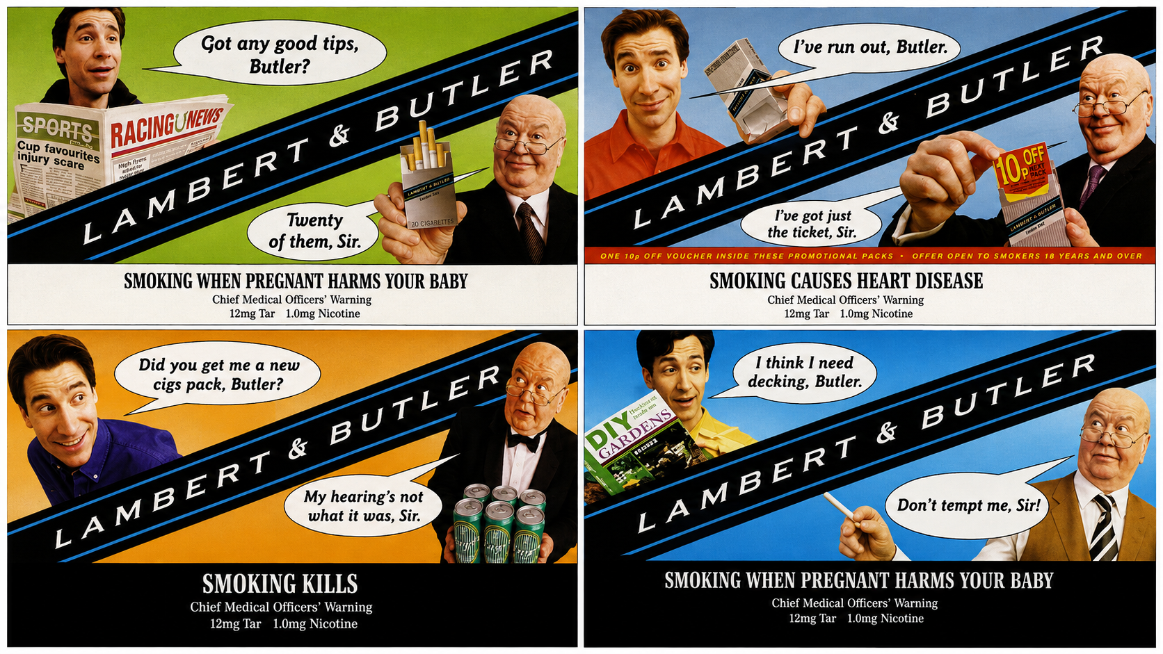
You had Lambert, the faintly hapless upper-class gentleman, and Butler, his long-suffering servant, swapping little speech-bubble gags. “I think I need decking, Butler.” “Don't tempt me, Sir.” Or Lambert asking whether Butler has obtained his new cigarettes, only to find him holding cans of beer and replying that his hearing isn't what it was.
They're almost newspaper cartoons. Recurring characters, familiar situation, set-up, punchline. Read it, smile, move on.
The relationship inevitably has more than a whiff of P.G. Wodehouse about it: a foolish gentleman and the considerably sharper servant charged with keeping him somewhere near reality. The advertising industry's attraction to that comic structure wasn't new, either. Croft Original had explicitly used Jeeves and Wooster from the 1970s onwards, including an execution directed by Ridley Scott, and its long-running campaign became an IPA effectiveness case study.
Contemporary research into Lambert & Butler actually described its territory as an “upstairs downstairs theme”. Consumers saw the advertising as straightforward and humorous, with some describing the humour as modern or quirky, although others found it rather middle-aged or a bit tacky. Which, frankly, sounds about right.
But that's what makes it interesting.
Where Silk Cut responded to restriction with abstraction, Lambert & Butler created characters. It gave a relatively ordinary cigarette brand a small comic universe that could be refreshed poster after poster. The characters became the distinctive assets.
And when the final tobacco advertising ban arrived, Lambert & Butler even managed to make the restriction itself part of the joke. One farewell execution pixelated Lambert and Butler's faces Crimewatch-style because they'd been “outlawed”; another borrowed from The Two Ronnies, with Lambert announcing “It's a good buy from me” and Butler replying, “And it's goodbye from us.”
Nothing revolutionary. Just really well understood poster advertising.
Reg: saloon-bar philosophy on a billboard
Then there's Regal. If Silk Cut was art-school clever and Lambert & Butler was Wodehousian, Regal's Reg was something else entirely.
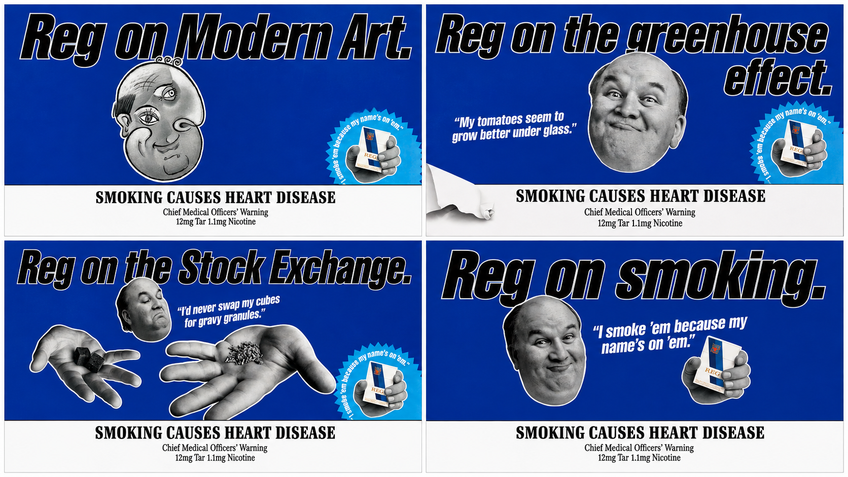
Reg arrived on British posters in 1993: balding, slightly dishevelled and deliberately ordinary, dispensing what Campaign later described as “saloon bar philosophy” on everything from politics to modern art.
“Reg on train spotting: There's one.”
“Reg on the meaning of life: Depends if you get time off for good behaviour.”
And the wonderfully stupid original: “Reg on smoking: I smoke 'em because my name's on 'em,” with his fingers covering the final letters of Regal.
The campaign, created at Lowe Howard-Spink, was a deliberately brash counterpoint to all the tasteful ambiguity elsewhere in cigarette advertising. Reg wasn't aspirational. That was essentially the strategy. The agency successfully argued that he was too “repulsive” and uncool to appeal to young people.
Unfortunately, reality then supplied a rather uncomfortable footnote.
Research published in the BMJ studied thousands of children and hundreds of adults and found that Reg was getting through to children more effectively than adults, with the strongest appeal among teenagers, particularly 14- and 15-year-old smokers. The Advertising Standards Authority asked for the campaign to be withdrawn in 1993.
That's important to include because this shouldn't turn into misty-eyed revisionism. The advertising could be clever, funny and beautifully crafted while still doing a job that society eventually decided it did not want done.
But creatively, Reg shows another response to the same constraint: if you couldn't sell an aspirational smoking lifestyle in the conventional way, perhaps you could build fame around a deliberately unaspirational bloke with a face and a joke.
Again, personality replaces proposition.
Hamlet: the confidence to leave the joke alone
Strictly speaking, Hamlet was a cigar rather than a cigarette, but no history of great British tobacco advertising makes much sense without it.
And especially without Gregor Fisher in the photo booth.
The premise is tiny. A man with a spectacular comb-over needs a passport photograph. The stool, the curtain, the timing and his hair conspire against him until resignation finally wins and he lights a Hamlet cigar while Jacques Loussier's version of Bach's Air on the G String arrives to tell us that happiness is, apparently, a cigar called Hamlet.
What makes the commercial extraordinary now is how little it tries to do.
It doesn't behave like a PowerPoint presentation that's somehow escaped onto a screen. There isn't a product benefit every four seconds. Nobody explains the insight. The joke is allowed enough space to become funny.
And because cigars were regulated differently from cigarettes, Hamlet had a much longer life in moving-image advertising than many people now realise. Campaign was still referring to its cinema presence when the wider tobacco advertising ban finally arrived in 2003.
There's a broader lesson there too. Sometimes the beautiful constraint isn't merely what you're forbidden to say. It's what you're disciplined enough not to say.
Marlboro didn't need the joke
Marlboro provides a different kind of case study again because, creatively, a lot of its British advertising wasn't nearly as inventive as Silk Cut or Benson & Hedges.
It didn't need to be. Marlboro owned a world.
The cowboy, the landscape, the horses, the huge American skies: Marlboro Country. It became such a recognisable advertising property that when the UK tobacco ban finally arrived in 2003, Nicorette immediately bought billboards and spoofed the departing Marlboro imagery.
And Marlboro Country most certainly wasn't just an American campaign that British consumers happened to know. Evidence given to the House of Commons around tobacco advertising included an actual UK Marlboro agency brief. Its objective was to evoke the brand values of individuality, freedom, authenticity and America, with the proposition “Escape to Marlboro Country.” The brief even talked about updating the imagery towards road-movie territory and explicitly discussed Marlboro Lights smokers.
Yet the really fascinating thing about Marlboro Lights in Britain during the 1990s is that the culture began doing some of the advertising for Marlboro.
The Marlboro Lights cigarettes became a fashion accessory.
In 2003, when European rules meant cigarettes could no longer use terms such as “light” and Marlboro Lights were becoming Marlboro Gold, The Observer described the white-and-gold packet as having been “the height of cool” and noted its association with everyone from Kate Moss to Tara Palmer-Tomkinson. The article specifically linked the brand's glamorous image to the supermodel era.
That isn't just hindsight. Vogue casually wrote years later about “a million Marlboro Lights” being smoked around Kate Moss, while a recent retrospective on 1990s fashion could almost summarise the decade with the observation that everybody smokes Marlboro Lights and falls out of black cabs.
So Marlboro demonstrates something slightly different. The advertising itself didn't have to win D&AD pencils for visual wit because decades of brand-building had created a cultural object. The cigarette packet had become a prop in somebody else's image.
That's an extraordinary achievement in branding. It is also precisely the reason tobacco advertising eventually became politically indefensible.
It's not over until the fat lady sings
And then there is possibly the most perfect ending to a campaign in advertising history. By the end of 2002, everybody knew the ban was coming. On 14 February 2003, tobacco advertising would disappear from British newspapers, magazines and billboards.
So Silk Cut returned to its familiar purple visual language one final time.
The image showed an enormous opera singer wearing a purple satin dress, the fabric split open. The thought was simply: “It's not over 'til the fat lady sings.”
Campaign reported that it was conceived specifically as Silk Cut's advertising swansong. When the ban finally came into force, the brand that had spent years turning restrictions into visual jokes had managed to turn its own extinction into one last visual joke. That is bloody good advertising.
More freedom. Less imagination?
And perhaps that's why these campaigns still fascinate me.
Advertising today has capabilities those creatives could barely have imagined. We can create practically any image. We can target individuals rather than audiences. We can animate, personalise, optimise and test thousands of variations. We can shoot a film without a film crew and publish it around the world before lunch.
In theory, we've never had more creative freedom.
Yet sometimes it feels as though that freedom has produced remarkably formulaic advertising: headline, product shot, three benefits, logo, CTA, resize into 17 formats and off it goes.
The great cigarette campaigns had almost the opposite problem. Every few years somebody seemed to remove another tool from the box.
So they found another tool.
When conventional lifestyle imagery became harder, Benson & Hedges created surrealism. When showing the product became unnecessary, Silk Cut built a language out of colour, texture and visual puns. Lambert & Butler created a comic double act. Regal created a bloke called Reg. Hamlet perfected miniature situation comedy. Marlboro built an entire imaginary country.
The constraints didn't automatically create good advertising, of course. Plenty of cigarette advertising was forgettable rubbish.
But the best creatives treated each restriction as another problem worth solving. That's the beautiful constraint.
I don't want cigarette advertising back
That bit matters. I don't. I gave up smoking years ago and I'm extremely glad I did. There were good reasons tobacco advertising was progressively restricted and eventually prohibited.
This isn't an argument for putting Silk Cut back on bus shelters.
It's an argument for remembering what the creative response to those restrictions can teach us.
The confidence to communicate one thing rather than twelve. The discipline to create distinctive brand assets and keep using them. The willingness to entertain people rather than merely interrupt them. The craft to create an image worth looking at. The patience to let an audience complete the thought themselves. And perhaps most importantly, the refusal to regard a restriction as an excuse for boring work.
When I appeared on Newsnight in 2011, I argued that we'd lost something creatively when cigarette advertising disappeared. Fifteen years later, I still think we did.
Not the cigarettes. Not the manipulation that persuaded generations of people that smoking could somehow make them cooler, freer or more glamorous.
I don't miss any of that.
But I do miss an era when a creative team could be told they weren't allowed to say something, weren't allowed to show something and increasingly weren't allowed to do something, and their response was not to make the idea smaller.
It was to make the idea better.