
Some advertising ages badly. The fashionable photography begins to look faintly ridiculous. The cultural references expire. The celebrity endorsing the product turns out to have done something unspeakable in a Travelodge. And the line that once sounded wonderfully contemporary starts to feel like it was written by a committee wearing red spectacles and Global Hypercolour T-shirts.
Then there are The Economist posters. More than three decades after the first famous red billboard appeared, the best of them still feel fresh, sharp and almost offensively good. They are studied by advertising students, collected by copywriters and repeatedly shared by people lamenting the decline of intelligent advertising.
Even Creative Review, writing more than 30 years after the campaign began, described David Abbott’s original work as difficult to beat. When Abbott died in 2014, The Independent praised the intelligence, wit and humanity of his advertising. Those three qualities explain why the work has lasted.
The posters didn’t merely advertise an intelligent publication. They behaved like one.
A campaign hiding inside a masthead
In 1988, The Economist had a problem. It was respected, certainly, but it was also perceived as dry, academic and narrowly concerned with business and finance. At a time when readers had more sources of information and rival publications were competing aggressively on price, the brand needed to be reconsidered rather than merely noticed.
Research had uncovered a useful connection. People associated reading The Economist with business success. So instead of producing posters that listed its sections, contributors or special subscription prices, the campaign would sell the emotional benefit of being a reader.
Reading The Economist gave you an edge. Not reading it might mean you were the person being edged out.
The agency was Abbott Mead Vickers, which became AMV BBDO after BBDO acquired a stake in 1991. David Abbott noticed that the publication’s red masthead was approximately the shape of a 48-sheet poster. That observation created one of advertising’s most enduring visual systems: a field of Economist red, a line of white serif type and almost nothing else.
The launch execution was brutal:
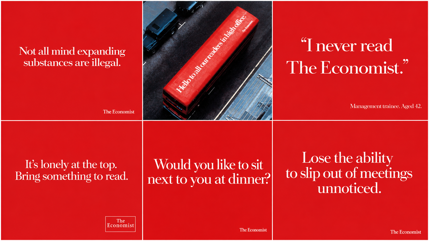
“I never read The Economist.”
Management trainee. Age 42.
No product shot. No body copy. No strenuous explanation of the joke.
Just nine words, depending on how generously you treat the attribution, which managed to communicate the product, the audience, the benefit and the consequence of ignoring it.
Abbott wrote it. Ron Brown art-directed it. Jo Hoza handled the typography. Together, they established a format that the rest of the agency’s creative department could explore for years.
The advertising was a demonstration of the product
The fundamental brilliance of the campaign is that it never simply claimed The Economist would make you better informed.
The advertising made you feel better informed.
Every poster presented a small intellectual transaction. You saw the line. You made the connection. You experienced the faint glow of satisfaction that comes from getting something quickly.
Then the brand quietly took the credit.
Consider some of the lines:
“Money talks, but sometimes it needs an interpreter.”
“In real life, the tortoise loses.”
“Not all mind-expanding substances are illegal.”
Or the wonderfully self-regarding:
“It’s lonely at the top, but at least there’s something to read.”
And:
“Would you like to sit next to you at dinner?”
They were not simply jokes placed above a logo. Each one expressed the same underlying promise from a different angle: read The Economist and you will understand more, think more clearly, progress further and become a more interesting human being.
David Abbott understood that stating this promise literally would sound pompous and unbelievable. As he later explained, a banal positioning such as “read this and be successful” could be made convincing through wit and charm. His broader principle was that things which cannot credibly be said literally can often be said laterally.
That is precisely what these advertisements do. They come at the proposition sideways.
Written at the intelligence of the audience
Most advertising is written below the presumed intelligence of the person reading it.
Every possible implication is explained. Every piece of wordplay is underlined. The headline tells you what the visual has already told you, then the body copy tells you what the headline has just told you, before a call to action instructs you to “discover more”.
The Economist campaign did the opposite.
It assumed attention. It assumed cultural knowledge. It assumed that the reader could recognise a cliché, proverb or familiar turn of phrase and enjoy seeing it twisted.
“Know your onions” was a classic example. So were visual executions built around phrases such as “fly on the wall”. The audience was required to perform a little work before receiving the reward. As creative director Ben Kay observed when comparing some of these executions with more literal advertising, the best left something for the audience to solve, allowing people to feel slightly cleverer for having understood them.
That was not an incidental creative flourish. It reflected the relationship The Economist wanted to have with its readers.
The publication has been described as a weekly debate between two intelligent friends. The advertising adopted the same manner. It did not lecture the audience or plead for approval. It offered them a thought and expected them to keep up.
In other words, the IQ of the advertising matched the self-image of the readership. And, perhaps more importantly, the desired self-image of the potential reader.
A compliment with a threat concealed inside it
The posters are often remembered for being witty. But beneath the wit, many of them are surprisingly ruthless.
“I never read The Economist” is funny because the imaginary speaker is 42 and still a management trainee. The joke contains a warning: that could be you.
Other executions played upon office politics, professional embarrassment, redundancy, intellectual inadequacy and the fear of being exposed as the only person in a meeting who did not understand what was happening.
One asked whether, in a meeting of minds, you would be sent out for the biscuits. Another suggested that sharp, stabbing pains in your back might mean the magazine was already too late to help.
The reader is flattered and threatened simultaneously.
"Smart people read The Economist. You are smart, aren’t you?"
This is status advertising of an exceptionally sophisticated kind. It does not show the reader a large house, expensive watch or executive car. It offers something more valuable to its audience: intellectual and professional status.
You do not display your success by owning The Economist. You prove you deserve your success by understanding it.
One idea that could keep thinking
The campaign also demonstrates the difference between a clever execution and a genuine advertising platform.
A clever execution gives you one good advertisement.
A platform gives you hundreds without losing its identity.
As Britain changed, the proposition beneath the posters evolved. During the success-driven late 1980s, the work promised an edge in business. In the recessionary early 1990s, it became more defensive, warning readers not to be found out. By the end of that decade, its focus moved towards self-improvement and becoming a more rounded, interesting person. Following September 11 and the uncertainty that followed, the emphasis shifted again towards understanding a complicated world and staying one step ahead.
Yet the campaign remained unmistakably itself.
Red.
White.
A thought.
That consistency produced extraordinary freedom. Writers could explore ambition, money, politics, careers, culture, sex, drugs, intelligence, power and insecurity, provided the line retained the campaign’s particular combination of confidence, wit and restraint.
The format became not a creative restriction but a creative test. There was nowhere to hide.
No seductive photography to rescue a mediocre thought. No expensive director, fashionable soundtrack or visual-effects department to make a thin idea appear substantial. Either the line worked or there was an enormous red rectangle exposing the fact that it didn’t.
The medium was part of the writing
The campaign was also far more visually and contextually inventive than the phrase “copy-led posters” might suggest.
A message placed on the roof of a bus greeted Economist readers working in “high office”. Taxi advertising made use of “The Knowledge”. Rotating sites carried the words “No spin”. Revolving airport posters played with “360 degrees”.
The setting completed the sentence.
That matters because great outdoor writing is not simply press copy enlarged until it fits a billboard. It understands where the message will appear, how quickly it will be read and what the surroundings can contribute.
Even the notorious long-copy poster understood this. It began by explaining that a poster should contain no more than eight words because that was supposedly the most an average reader could absorb at a glance.
Then it kept going.
Because this was a poster for Economist readers.
The breaking of the rule became proof of the audience’s intelligence.
It was not merely award-winning. It worked.
It is tempting to romanticise The Economist campaign as a beautiful relic from a time when clients bought copy-led ideas over lunch and nobody asked how the line would work as six-second vertical video.
But the campaign did not survive because advertising people admired it.
It survived because it delivered.
By the end of 2003, The Economist reported that UK circulation had increased by 73% over the broader period in which the advertising ran, while subscriber numbers had risen by 113%. Econometric modelling attributed measurable proportions of newsstand sales and subscriptions to the outdoor work, with a reported revenue payback of 1:1.4.
Between 1988 and the end of 2003, the “White out of Red” campaign also collected 93 creative awards across organisations including D&AD, Cannes, the One Show, the Clios and the IPA.
That is the bit sometimes forgotten when people discuss the supposed conflict between creativity and effectiveness.
The Economist work was effective because it was creative.
The wit encouraged people to notice it, process it, remember it, discuss it and attach its intelligence to the brand. The writing was not decoration added after the strategy.
The writing was the strategy made public.
Well-Written and Red
Alfredo Marcantonio eventually documented the story in Well-Written and Red, first published to celebrate the campaign’s development and later expanded as The Continuing Story of The Economist Poster Campaign.
Marcantonio was himself one of Britain’s most respected copywriters. He joined the newly merged AMV BBDO as vice-chairman in 1991, although it is important to distinguish his role as chronicler and senior agency figure from David Abbott’s role as the creator and writer of the original idea.
The title is perfect, of course.
But perhaps the campaign was not only well written and red.
It was well written and read.
People looked at these adverts because reading them gave pleasure. They contained observations rather than announcements. They rewarded intelligence rather than insulting it. They understood that advertising is an interruption and therefore has a duty to make that interruption worthwhile.
Dave Trott’s admiration for Abbott was so great that, when Abbott once placed both their names together in an industry advertisement, Trott said he would have paid for the privilege. That is some endorsement from one of British advertising’s other great advocates of direct, forceful thinking.
Too clever for its own good?
There is a fair criticism of the campaign.
Its exclusivity could tip into smugness. By defining readers as intelligent, successful insiders, it inevitably defined non-readers as the opposite. Later research for The Economist found that the historic white-on-red work could make the brand feel elitist and inaccessible. The company subsequently attempted to become more open, human and emotionally engaging.
Some later executions also felt like imitations of The Economist advertising rather than the real thing: puns wearing the correct brand colours but lacking the effortless logic of the best Abbott lines.
That is the danger with any famous creative formula. Eventually, people reproduce its surface features without recreating the thinking that made them powerful.
Red background? Yes.
White type? Yes.
Cleverish play on words? Yes.
Actual insight? Ah.
But the finest work never laughed at the audience for failing to understand it. It invited the right audience to laugh with it. That distinction is tiny and enormously important.
Still setting the standard
The ultimate evidence of the campaign’s power is that The Economist keeps returning to its language.
In July 2026, a new outdoor campaign created with independent agency Cocogun once again used the familiar red, white and stripped-back copy. Lines including “Think outside the bot” and “actual intelligence” turned the classic voice towards artificial intelligence and the value of human judgement.
Cocogun creative partner Ant Melder described the brand’s legacy as containing “some of the greatest advertising the world has ever seen” and joked about the terrifying prospect of David Abbott judging the new work from somewhere above.
That terror is understandable. Because The Economist posters remain the test.
Can you communicate a compelling benefit without stating it literally?
Can you flatter your audience without fawning over them?
Can you be clever without becoming obscure?
Can you produce a line that rewards a second look but survives the first?
Can you turn seven or eight words into a complete expression of a brand?
Most advertising struggles to do one of those things. The best Economist adverts did all of them. White out of red. Writing out of this world.